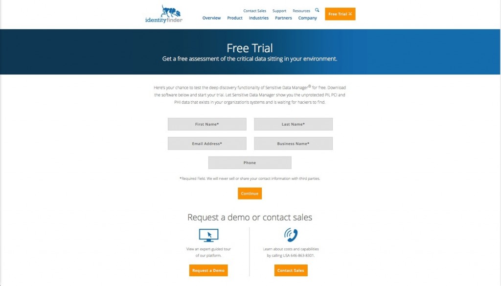
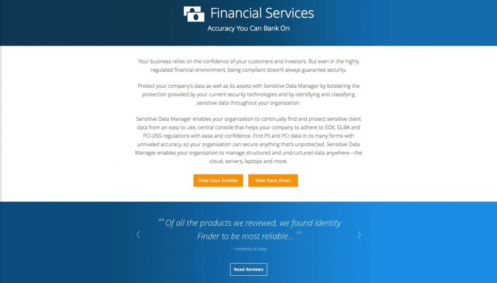
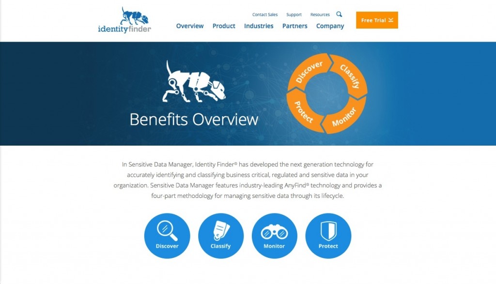
Identity Finder’s goal in rebranding was simple; their challenge was anything but. As their company had evolved and SEO efforts had run amok over the years, their messaging had become unwieldy. Paul Kiesche Design brought me in to help untangle the text and streamline what is actually a very simple and unique selling proposition.
The premise behind Identity Finder’s unique SaaS is that hackers are going to break into your organization at some point, no matter how sophisticated your security efforts. So in addition to your “blocking” measures, you also need to identify your riskiest data and either dispose of it or encrypt it. The trick is finding the toxic data that’s hidden throughout your organization. And that right there is what Identity Finder does better than anyone else.
So back to the copywriting challenge I faced: simplifying without decimating. In short, I had to know what to cut—namely a lot of talk about complex algorithms. I also had to know what to keep—namely the compelling details that drive a purchase decision. So my role was to highlight the Sony-size risks of unprotected data and the thoughtful, brilliant ways Identity Finder looks out for your organization and the unique challenges it faces.
Addressing over 10 distinct fields ranging from finance and hospitality to insurance and healthcare got a little complicated. But in the end, speaking directly to the specific needs of each group was simply the right thing to do.

