
NAFA Fleet Management Association brought me in to help market a one-of-a-kind on-demand webinar series for aspiring fleet managers. NAFA had been producing industry-leading content for some time, but until the Fleet 101 campaign, hadn’t packaged and aggressively promoted its programs in this way. Smart idea, especially with a quality program like this one. My […]
Why Google hates your website.
At TMSA’s 2018 Logistics Marketing and Sales Conference, Chris Peer, President & CEO of Digital Marketing Agency, SyncShow delivered a highly-relevant presentation entitled “10 Reasons Google Hates Your Transportation Website.” I can safely say that Chris’s tips apply to every site and every industry under Google’s sun today. As a classic cobbler’s son who’s prone […]
How to boost the persona-appeal of your high-value web pages.
(Part 2 of my 3-part guide to writing genuinely customer-focused website copy.) Are you talking to yourself? I feel like I should interrupt, but I don’t want to be rude. It’s an easy trap to fall into when it comes to the copy on your website. We spend so much time defining a mission and […]
So how does your buyer persona feel about your website?
Part 1 of my guide for ensuring your website content is genuinely customer-focused. There’s an anecdote in How to Win Friends and Influence People, where author, Dale Carnegie recounts the story of meeting someone at a party who talked nonstop about themselves. Carnegie hardly said a word, but after the party the person recounted to […]

NEW YORK SHIPPING EXCHANGE – BRANDING & WEBSITE
I used an outside-in approach to help NYSHEX develop website content that appealed to the needs and concerns of three distinct audiences for the exchange: carriers, shippers and 3PLs. In addition to getting to know the markets and what motivates them, I dove deep into understanding the exchange and how it works. I also employed […]
Add peanut butter to your website’s career page copy.
One of the best things about freelancing at this one company was the copious snack collection offered free to all workers. Granola bars, fruit, juice, chips, artisan coffee—and yes, fresh peanut butter right from the machine. So when it fell upon me to write a career page that portrayed the company’s outstanding opportunities as […]
REASONABLE DISCOVERY – WEBSITE
It’s always a thrill to help a new company develop its brand messaging. The folks at Reasonable Discovery, a technology-driven legal consultancy, brought me in to develop their website copy. The project entailed helping them determine their “voice”, differentiate their brand and tell their story. With service providers like Reasonable Discovery, the tendency is to […]
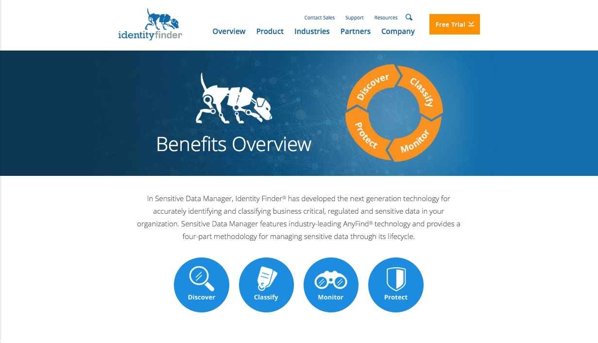
IDENTITY FINDER WEBSITE
Identity Finder’s goal in rebranding was simple; their challenge was anything but. As their company had evolved and SEO efforts had run amok over the years, their messaging had become unwieldy. Paul Kiesche Design brought me in to help untangle the text and streamline what is actually a very simple and unique selling proposition. The premise behind […]

SEALAND – WEBSITE
I helped develop the brand messaging and website content for SeaLand. We positioned this iconic brand from the 50’s as the people’s shipping line—an ally of businesses and champion of the hopes and dreams of all the Americas. The tone is exciting, personable and bubbling with can-do spirit—a complete departure in the shipping industry, and a perfect fit […]
-
 Nine Steps to Great Naming: Part II
-
 The Nine Steps to Great Naming: Part I
- The Beaucoup Benefits of Working with a Professional Copywriter
- Should You Be Podcasting: Benefits of a Written Blog
- Write a Newsletter: 10-1/2 Reasons Why
- 2023 TMSA ELEVATE Conference Raises Top Issues in Transportation Sales and Marketing